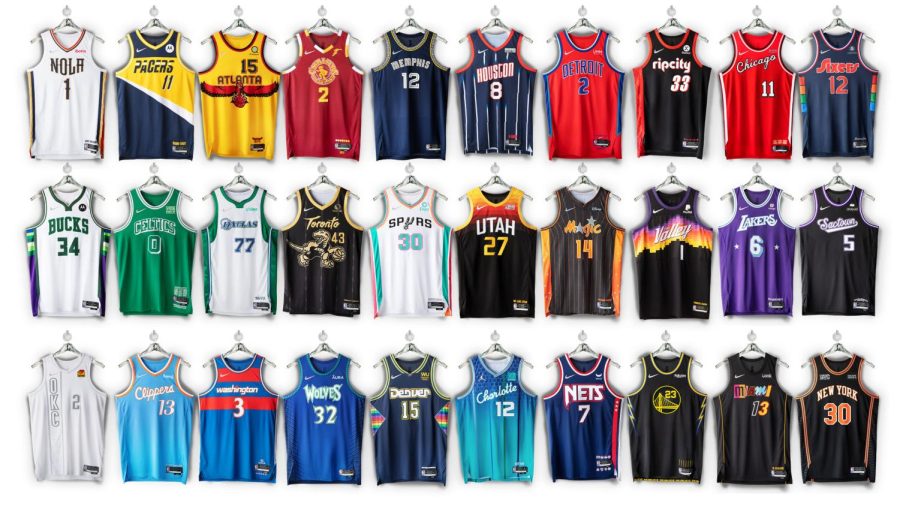
A Ranking of the 2021-22 NBA City Edition Jerseys
November 19, 2021
The 2021-2022 NBA city edition jerseys were all announced this month and now that they’ve had a chance to hit the court, I’ve decided to rank them in terms of appearance, detail, and concept. It’s safe to say there were a lot of surprises from the new designs- some of them pleasant while others were, well, less pleasant.
Honorable Mention:
Denver Nuggies
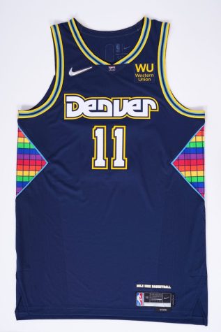
To be frank, this jersey was initially an eyesore. However, after seeing its debut against the Rockets in early November, it quickly grew on fans. Aptly named the “Mixtape Jersey”, it’s a combination of elements from all the Denver eras. From the yellow and baby blue trim to the retro font and the original rainbow skyline era, the Nuggets effectively combined older jerseys to create a new look.
Top 5:
5. Philadelphia 76ers
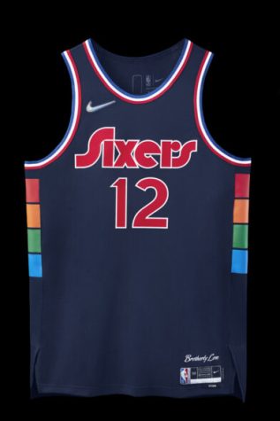
The Sixers recognize the legendary Philadelphia Spectrum Arena with a sharp multicolor pattern running up the sides. With a playful and clean design that celebrates the iconic city and its arena, this jersey had to make the top 5.
4. Houston Rockets
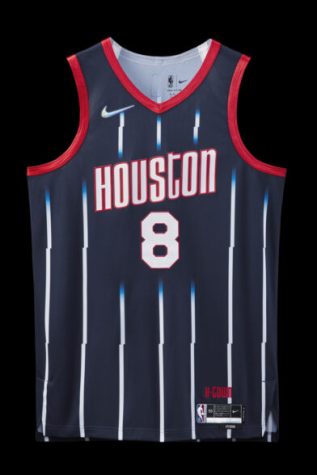
As one of the few franchises to win back-to-back titles, this year’s city jersey gives a nod to their ‘94 and ‘95 championship years. Between the red and navy color combination and the bright pinstripes, H-Town created an appealing retro aesthetic all while recognizing their rich and accomplished history- hopefully Olajuwon is proud of this one.
3. Chicago Bulls
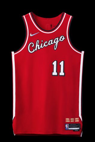
You can’t go wrong with a classic. Although the blue of their city jerseys from the 19-20 season is undeniably nice, it’s a relief to see the return of the familiar red. The cursive typography from the ‘84 season also pays homage to the G.O.A.T’s rookie year. With a clean yet tasteful design that gives a nod to Michael Jordan, Chi-town did a solid job on this one.
2. Minnesota Timberwolves
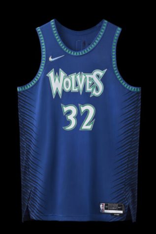
Minnesota’s jersey is jam packed with tasteful details. It’s a juxtaposition between old and new, with blended elements from three eras of the Timberwolves, all while giving a fresh look. The blue, green, and white from the original 1989-96 jersey returns here, and the cute tree trim from 1996-2000 evokes nostalgia for older fans. The most pleasing component of this jersey is the playful font, which is a remix of their 2004 logo.
1. Toronto Raptors
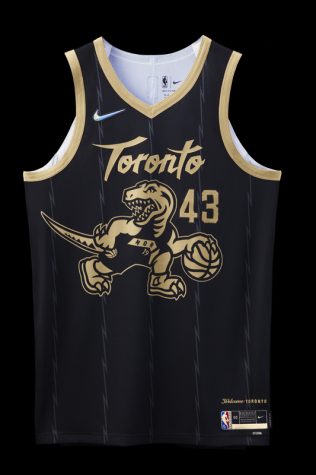
Aside from the overall pleasing aesthetic of this jersey, there are so many details that push it to be #1. Large logos on the front of a jersey are either a hit or miss, and it’s usually the latter as most of them turn out to be tacky. However, the iconic dino logo hit the bullseye on this one, and the black and gold trim gives it a more classy look. The raptor, whose head typically faces forward, has now been flipped so it can, “look back at the team’s history.” The North needs to be given credit for such a well done jersey, with the subtle jagged pinstripes being the cherry on top.
Bottom 5:
Miami Heat
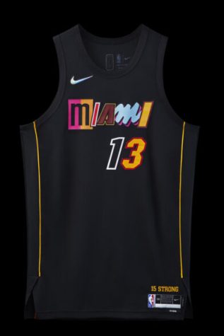
Perhaps it was because their last two city jerseys were such a hit that this one was a major upset. The concept of mixing their past designs for the lettering is admirable but it created an overall look that’s visually unappealing; it kinda looks like a ransom note. Look, I’ll give you the money and meet all your demands- just please don’t hurt Jimmy Buckets.
Cleveland Cavaliers
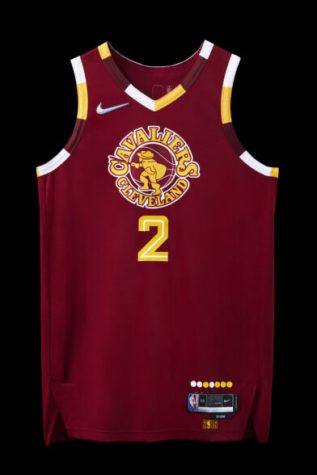
The Cavs might’ve been going for a more classic look here by sticking with the signature gold and yellow, but the circular logo and swashbuckling Swordsman in the center is just not a good look. The Cavs might’ve been champions in 2016, but this jersey is certainly not a dub. It gives off middle school vibes.
New Orleans Pelicans
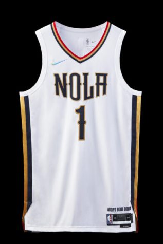
There isn’t too much to complain about with this jersey because New Orleans played it pretty safe. However, that’s exactly the problem. The lack of boldness resulted in a design that’s far too similar to their normal home jerseys.
Orlando Magic
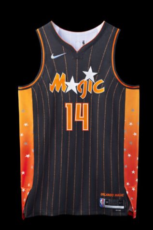
We get it- Florida is famous for their citruses but please stop trying to incorporate orange into your jerseys. It hasn’t worked for the past two seasons and this year is no exception. Although the ambition of this jersey should be acknowledged, it didn’t pay off.
Oklahoma City Thunder
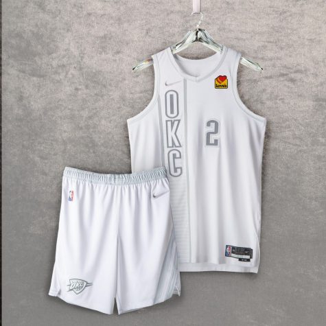
A clever and funny review can’t even be written for this jersey because of how boring it is. A jersey this bland deserves a review that matches the same energy.
Complete ranking* (best to worst):
- Raptors
- Timberwolves
- Bulls
- Rockets
- 76ers
- Nuggets
- Nets
- Clippers
- Bucks
- Trailblazers
- Lakers
- Mavericks
- Pistons
- Kings
- Celtics
- Wizards
- Warriors
- Knicks
- Grizzlies
- Hornets
- Pacers
- Spurs
- Hawks
- Heat
- Cavaliers
- Pelicans
- Magic
- Thunder
*Jazz and Suns were excluded from the ranking because they used their previous designs


jake • Nov 19, 2021 at 12:35 PM
bucks too low